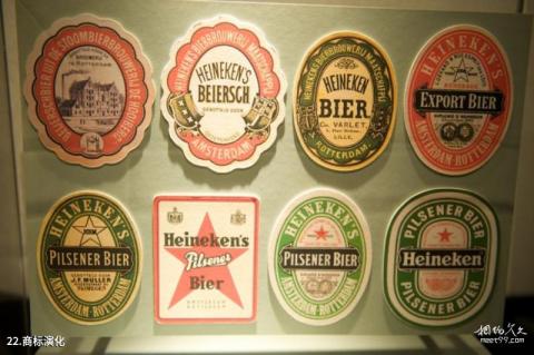
Introduction to trademark evolution: After many evolutions of the Heineken trademark, the color was finally determined to be green, which symbolizes nature, freshness and vitality. The three English letters e in the logo are slightly tilted, and the letters are cleverly designed to look like a smile. The mouth represents the expression of joy when enjoying beer.